How to Create a Restaurant Menu in 8 Steps

How to build a restaurant menu that sells — choosing the dishes, costing and pricing them, writing descriptions, structuring sections, and laying it out so the profitable items get read.

A menu is not a list of what you can cook. It's the only sales document in the restaurant that every single customer reads, usually for two to three minutes, with their full attention. Very few businesses get that. Most restaurants treat it as an inventory.
Quick answer: Build a restaurant menu in eight steps — decide the concept's boundaries, draft the dish list, cost every plate, price against both cost and perceived value, write descriptions with facts in them, group into sections a customer would recognise, lay it out so the profitable dishes sit where eyes land, then test and cut. Aim to remove dishes, not add them.
This is about creating the menu itself. Getting it onto your website afterwards — as readable text rather than a PDF — is a separate job covered in How to Put Your Restaurant Menu Online.
Step 1: Define the boundaries before the dishes
Write one sentence describing what your restaurant is, then use it to reject things. "A Neapolitan pizzeria that also does pasta and burgers" is a sentence that will produce a bad menu, because it can't reject anything.
Practical constraints to fix now:
-
Kitchen capability — the equipment you have and the number of hands on a Saturday
-
Prep time — how much can be done before service
-
Storage — a menu wider than your walk-in produces waste
-
Skill floor — every dish must be executable by whoever is on shift, not just by you
The menu you can execute at 8:15pm on a Saturday is the real menu. Everything else is a plan for inconsistency.
Step 2: Draft the dish list — then plan to cut it
Start wide, then reduce hard. A useful shape for most independents:
Section | Items | Why |
|---|---|---|
Starters | 5–7 | Enough choice without slowing decisions |
Mains | 7–10 | The core; more than this and quality drifts |
Sides | 4–5 | High margin, easy add-on |
Desserts | 4–5 | Most can be prepped ahead |
Drinks | Separate list | Deserves its own page and its own attention |
Longer menus feel generous and behave badly: more waste, slower service, weaker execution, and a customer who takes longer to decide and enjoys the decision less. If you're agonising over cutting a dish, that's evidence it's marginal. |
Reserve two or three slots for specials rather than fixed dishes. That's where seasonality, supplier luck, and your cooks' interest live, without destabilising the printed menu.
Step 3: Cost every plate properly
No dish goes on the menu until you know what it costs. Properly means:
-
Every ingredient at its actual purchase price, including the parts you trim away
-
Yield loss — a whole fish is not the same as the portion that reaches the plate
-
Garnish, oil, butter, salt. Small, but real across a service
-
Not labour or rent — those are covered by your overall margin target, not per-plate
Divide the plate cost by the price to get food cost percentage. Most full-service restaurants target roughly 28–35%, though it varies widely by format and market — check what's normal for yours rather than trusting a general figure.
Step 4: Price on value, not only on cost
Cost gives you a floor. It doesn't give you a price.
Price against what the customer is comparing you to. They're not calculating your margins; they're comparing your pasta to the pasta at the place they went last month.
Accept that percentages vary across the menu. A steak may run a high food cost percentage and still contribute the most cash per plate. Cash margin pays your rent — percentage doesn't. Look at both.
Use the drinks list to do the heavy lifting. Beverages typically carry far better margins than food. A well-built drinks list is often the difference between a viable restaurant and a struggling one.
Drop the currency symbol and trailing zeros if it suits your format — "18" reads lighter than "$18.00". Small, well-evidenced, costs nothing.
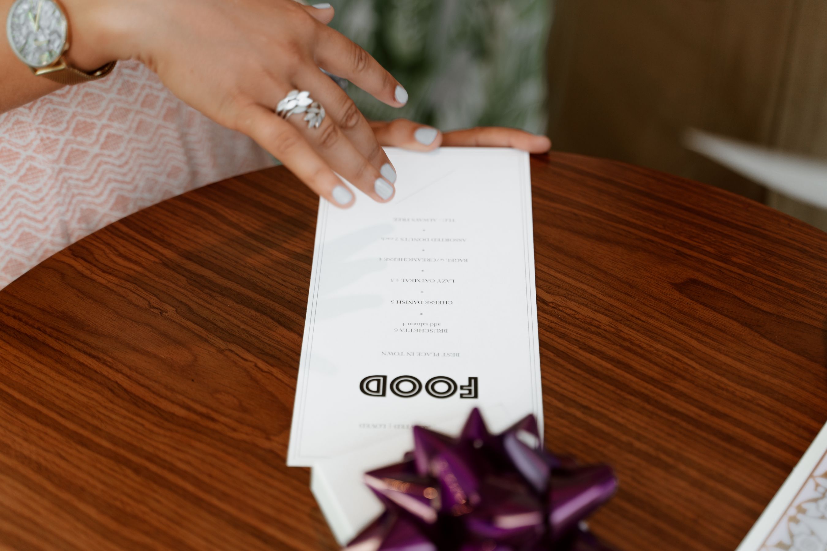
Avoid a price column. A right-aligned column of prices invites people to read down it and choose the cheapest. Set the price immediately after the description instead.
Step 5: Write descriptions that contain facts
The rule that fixes almost every bad menu description: every description should contain at least one thing the reader couldn't have guessed.
-
Weak: "Delicious hand-crafted pasta made with love and the finest ingredients"
-
Strong: "Cacio e pepe — Tuscan pecorino, black pepper toasted to order"
The second is shorter and does more. Specificity is what persuades; adjectives are what people skim.
What earns its place in a description:
-
A producer or origin — the farm, the region, the dairy
-
A technique or time — cured 48 hours, wood-fired, aged
-
A cut or variety — heritage tomatoes only if they actually are
-
Genuine allergen and dietary information, as small consistent marks rather than shouted capitals
What doesn't: "delicious", "mouth-watering", "our famous", "passion". Also — never claim what isn't true. Guests who care notice, and the ones who notice are the ones who tell other people.
Keep to one or two lines. A menu of paragraphs doesn't get read.
Step 6: Group into sections a customer recognises
Order by how people eat, not by how your kitchen is organised. Sections named after kitchen stations ("Grill", "Larder") are for staff, not guests.
Watch for section names that hide dishes. If your best-selling item is filed under a heading nobody scans, it isn't the dish that's underperforming.
Put dietary options within their sections rather than in a separate ghetto at the back. A vegetarian guest wants to be eating from the same menu as everyone at the table.
Step 7: Lay it out so eyes land on the right things
Menu layout is a real discipline. The parts that reliably matter:
Position. On a single-page menu, the area near the top right gets disproportionate attention. On a folded one, it's the top of the right-hand panel. Put a high-margin dish you're proud of there — not your cheapest, and not something you'd hate to make forty of.
Boxing and space. A dish set apart in a box or given extra whitespace gets noticed. Use it two or three times at most; do it more and the effect disappears.
No leader dots. The row of dots running from dish to price drags the eye straight to the number.
Typography that's actually readable. 16px minimum on a phone, real contrast, no cream text over a photograph of the dish. Elegant tiny grey type is the most common failure, and your guests are frequently reading in low light.
One column, on mobile. Whatever the printed version does, the web version needs a single column with real space between items.
Step 8: Test, measure, and cut
A menu is a living document.
-
Track sales per dish. Everything falls into: sells well and profitable (protect it), sells well and unprofitable (reprice or re-engineer), sells badly and profitable (move it somewhere more visible), sells badly and unprofitable (cut it, today).
-
Review quarterly, with the seasons.
-
Change one thing at a time where you can, or you won't know what worked.
-
Ask the floor staff. They hear the hesitations, the substitution requests and the "what's that?" questions you never will.
Cutting the bottom two dishes is nearly always the highest-return menu change available, and nearly always the one owners resist most.
Getting it in front of people
Once the menu exists, it needs to be readable everywhere — on the table, on a phone, in a search result, and in an AI assistant's answer to "who does gluten-free pasta near me."
That last one is newer and matters more each year. It only works if your menu is real text on your own website. A PDF or a photograph of the printed menu is invisible to all of it.
This is where AI website builders have changed the maths for independents. Automated business website creation now covers what used to be an agency project:
-
AI copy design and code generation — the menu page's structure, wording and working front-end code produced together in one pass
-
Multi-page website generation — food menu, drinks list, brunch and set menus as separate real pages, since people search for them separately
-
Mobile-ready website creation — a single-column readable menu on a phone, which is where it's actually read
-
SEO and lead generation — meta tags, Open Graph and LocalBusiness structured data emitted at publish, plus reservations wired in
Most of these tools are a general small business website builder with a restaurant template attached, so any website builder comparison you run should test one thing above all: paste your real menu in and see whether the AI web design still holds at forty dishes on a phone. Gallery demos have twelve.
With InMinutes, fast website creation puts a draft in front of you in minutes, and no-code website development keeps menu changes to a sentence rather than a rebuild — which is the thing that determines whether your online menu still matches the printed one in six months. If you take reservations, the booking flow is generated into the same site rather than sending guests to an online booking website on someone else's domain. Table reservations are included on every plan, including the free tier; taking a card deposit at booking time needs Pro, since it runs through Stripe Connect.
FAQ
The bottom line
Create the menu by subtraction: fewer dishes, costed properly, priced on value, described with facts, and laid out so the profitable plates get seen. Then publish it as real text so it can be read on a phone and quoted by a search engine. Build your restaurant's site free with InMinutes →
See also The 15+ Best Restaurant Websites of 2026 and Charm Food Enthusiasts With Restaurant Website Designs.

Guides10 min read
Guides11 min read

Guides9 min read

Guides9 min read