Charm Food Enthusiasts With Restaurant Website Designs

How restaurant website designs actually persuade people who care about food — typography, photography, pacing, and the copy that sounds like a cook wrote it rather than a marketer.

A food enthusiast is a specific kind of visitor. They are not deciding whether to eat — they are deciding whether you are worth the trip across town. They read menus for pleasure. They notice when a description says "heritage tomatoes" and the photograph clearly shows supermarket ones. Designing for them is a different job than designing for someone who just wants lunch.
Quick answer: Restaurant website designs charm food enthusiasts through specificity, not polish. Name the producer, name the cut, show the real plate, write like a cook rather than a marketer, and let the menu breathe with generous typography. An AI website builder can produce the layout and the structure in minutes; the specificity is the part you supply, and it's the part that does the persuading.
What food enthusiasts actually read
Watch the analytics on any independent restaurant site and the pattern is consistent: the menu page gets the traffic, and it gets the dwell time. Everything else is navigation.
So the design question is not "what should the homepage look like." It's "what does a menu page look like when someone is reading it the way other people read a magazine."
Give the menu room
Cramped menus read as cheap. The single highest-impact design change most restaurant sites can make is increasing line height and section spacing on the menu page. Dishes need air around them the way plates do.
-
Section headings that are clearly headings, not slightly bigger body text
-
One dish per line on mobile, never a two-column squeeze
-
Price aligned but not shouting — a subtle tint, not bold black
-
Dietary tags as small marks, not blocks of capital letters
Write descriptions a cook would recognise
"Delicious hand-crafted pasta made with love" says nothing. "Cacio e pepe, Tuscan pecorino, black pepper toasted to order" says everything, and it takes fewer words.
The rule: every description should contain at least one fact the reader couldn't have guessed. A producer's name, a technique, a length of time, a region. That's the whole trick.
Typography does most of the work
Restaurant website designs live or die on type, because a menu is fundamentally a typographic object.
Two typefaces, maximum. One for headings with some character, one entirely neutral for body and menu text. The character font should never be the one people have to read forty lines of.
16px minimum on body, 17–18px on menu items. Your diners are frequently over forty and frequently outdoors. Elegant 13px grey text is the most common accessibility failure on restaurant sites.
Contrast that survives sunlight. Cream on a pale food photograph looks beautiful in a design tool and disappears on a phone on a terrace. If the menu sits over an image, it needs a solid backing.
Photography: real, imperfect, yours
Food enthusiasts are unusually good at spotting stock photography, and it costs you credibility instantly. The hierarchy that works:
-
The room, shot at the hour it looks best — usually just after opening, warm light, before the tables fill
-
Three or four dishes you always have on, photographed on your actual plates
-
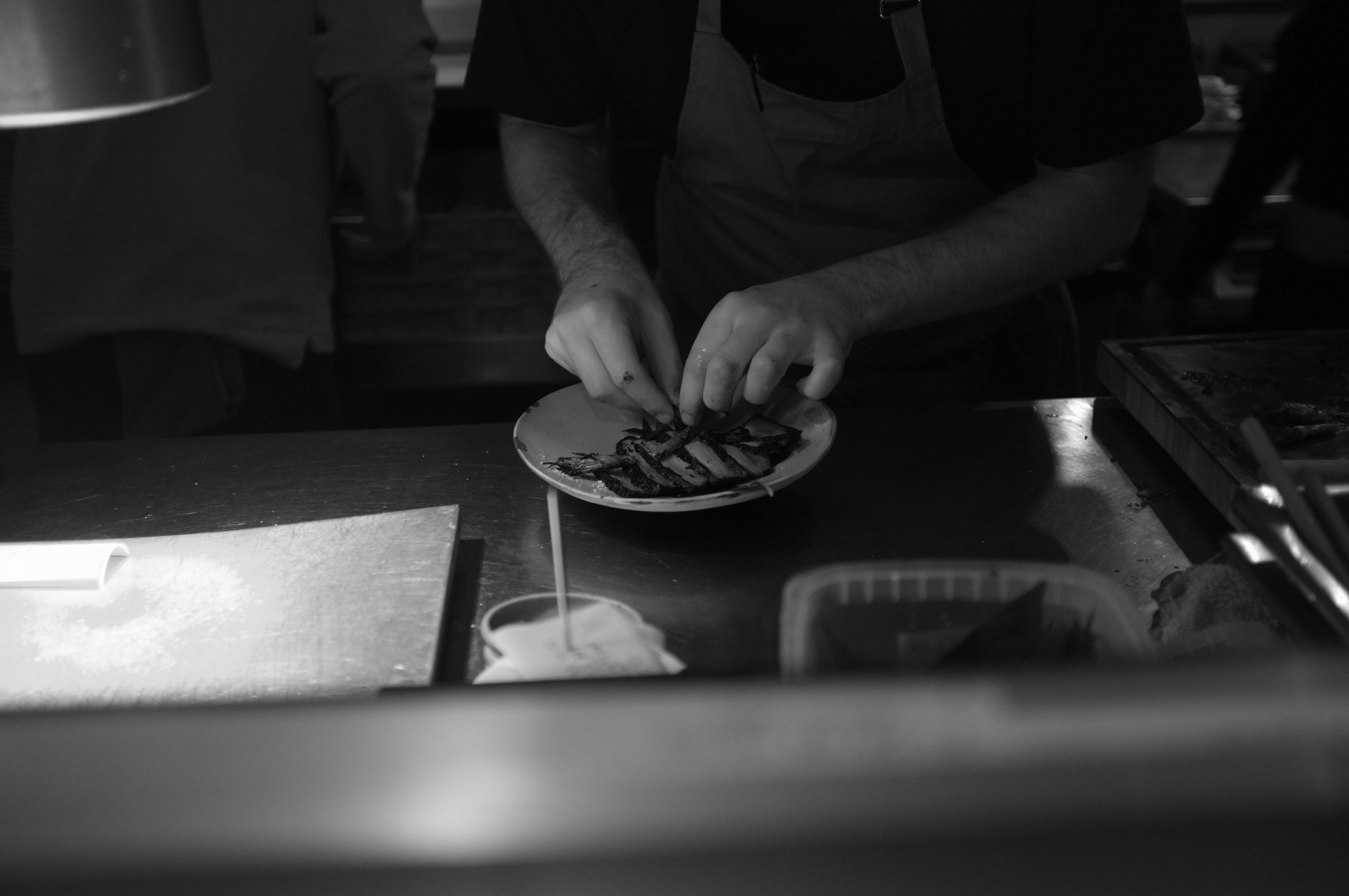
A person — a cook, the pass, hands doing something
-
Everything else
Ten honest phone photographs beat three borrowed ones. Compress them properly, though: a gorgeous 4MB hero image that takes six seconds on mobile data has cost you the visitor before they saw it.
Pacing: what appears in what order
Think of the homepage as a sequence rather than a page.
Position | What belongs there | Why |
|---|---|---|
Above the fold | One line of positioning, one photo, View menu | Answers the actual question |
Next | Two or three dishes with real descriptions | Proof of specificity |
Next | Booking, with visible availability | Converts the persuaded |
Next | The room, the people, the story — briefly | Builds the trip-across-town case |
Footer, every page | Hours, address, phone that dials | Removes friction |
The mistake nearly everyone makes is putting the story first. The enthusiast wants evidence before narrative. |
Where an AI website builder fits
None of the above requires custom development any more, which is a genuine change from a few years ago. Modern AI website builders handle the structural and technical layer so your effort goes into the specificity that actually charms people.
What automated business website creation covers for a restaurant:
-
AI copy design and code generation — the words, the layout, and the working front-end code produced together in one pass rather than assembled separately
-
Multi-page website generation — menu, wine list, about, private hire, and booking as distinct real pages with their own URLs
-
Mobile-ready website creation — phone-first layouts, since that's where the traffic is
-
SEO and lead generation — meta tags, Open Graph, and LocalBusiness structured data emitted at publish, plus booking and enquiry forms wired up
-
No-code website development — you edit by describing the change, not by touching markup
Worth being precise about what you're choosing between, though: most of these tools are a general small business website builder with a restaurant template on top. That's perfectly workable, provided the template survives a real forty-dish menu and the reservations flow stays on your own domain rather than bouncing to an online booking website somebody else owns.
With InMinutes, fast website creation means you describe the restaurant and get a multi-page draft back in a couple of minutes, then replace the placeholder text and images with your own. Appointments are included on every plan, including the free tier, so a booking-led design isn't gated; taking a card deposit at booking time is the piece that requires Pro, since it runs through Stripe Connect. Publishing to your own domain is on the paid plans.
The honest limitation: this gives you a well-structured, good-looking site quickly. It does not give you an art-directed identity. If your restaurant's positioning is design-led — the kind of place where the website is part of the concept — hire a designer and have them work from the generated structure rather than from nothing. For most independents, the generated site is a large improvement on what exists and takes an afternoon rather than a quarter.
If you're weighing options, our website builder comparison for restaurants goes through where each tool actually differs, and /vs/squarespace covers the closest design-led alternative.
Three design mistakes that cost you the enthusiast
Autoplaying video of the kitchen. It delays the menu, eats mobile data, and nobody has ever booked because of one.
A PDF menu. It signals that the menu changes rarely and that nobody maintains the site. It also can't be read comfortably on a phone or quoted by an AI assistant answering a "who serves X near me" question.
Prices hidden until you arrive. Enthusiasts read prices as information, not as a barrier. Hiding them reads as insecurity.
FAQ
The bottom line
Charming food enthusiasts is a copy and photography problem wearing a design costume. Give the menu room to breathe, write descriptions with facts in them, shoot your real room, and let the structure be generated so your time goes into the parts that persuade. Build your restaurant's site free with InMinutes →
See also How to Put Your Restaurant Menu Online and How to Make a Restaurant Website in 8 Steps.

Design10 min read

Guides10 min read

Strategy11 min read
Guides11 min read